PEP 6305 Measurement in
Health & Physical Education
Topic 2:
Organizing Data
Section
2.2
 Click to go to
back to the previous section (Section 2.1)
Click to go to
back to the previous section (Section 2.1)
Tables and
Spreadsheets
n
A table contains data in rows and columns. Typically, a
table summarized the data for groups of subjects and certain variables rather
than reporting the data for all subjects and variables.
n
A spreadsheet is a table contained in a computer program (such as
Excel) that allows you to perform computations using formulas to combine the data
found in the rows and columns.
n
Traditionally, in a spreadsheet each subject is one row, and each
variable is one column.
¨
This is the "standard" way to enter data to spreadsheets for
statistical analysis.
¨
Most statistical software programs require this
type of layout.
¨
If you have to enter data, use this
type of layout.
n
Table 2.5 from the text shows four variables for five subjects
(each subject has their own row).
What are the four variables? (Answer)
|
Subject
|
Height
|
Weight
|
BMI
|
|
1
|
60
|
150
|
25
|
|
2
|
70
|
165
|
21
|
|
3
|
62
|
160
|
25
|
|
4
|
65
|
130
|
19
|
|
5
|
67
|
200
|
27
|
n
Most spreadsheet programs allow you to sort (put the values
in alphabetical or numerical order) the rows according to
one of the columns/variables, which creates a simple frequency distribution for
that column/variable within the spreadsheet. 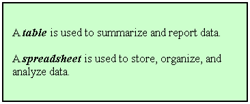
n
Spreadsheets are good for organizing and storing data, but not for
displaying it in a report.
n
Tables can be a good way to summarize data for a presentation or
written report.
¨
You will create tables in subsequent lecture topics that are
similar to what you see in published research papers.
¨
Most
tables do not have a row for each subject, but will summarize the
variables (in columns)
by
groups (in rows).
Graphs
n
A graph is an image or drawing that represents the way
that data are distributed. Most statistical programs and spreadsheet programs
can create data graphs.
n
There are several types of graphs; each one displays data in a
different way. We will dicuss bar graphs and histograms here, and discuss
scatterplots in a later topic.
Bar Graphs and
Histograms
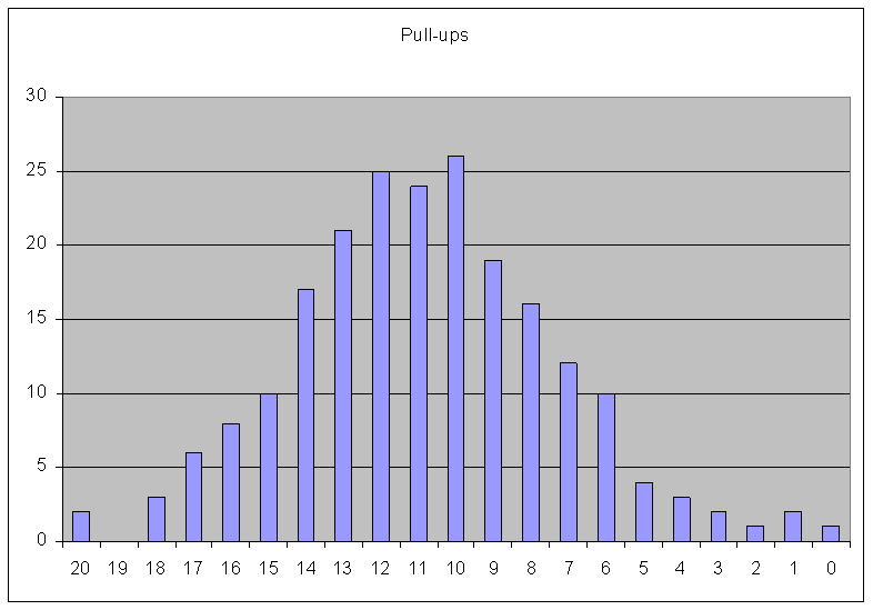
n
A bar graph is a picture of a simple frequency
distribution. The values of the variable are shown along the x-axis, and the
frequencies (counts of each value) are shown on the y-axis. The height of the bar represents the
frequency of subjects who have the respective value in the variable range.
n
This is a bar graph of the pull-up data from our previous simple frequency
distribution example:
n
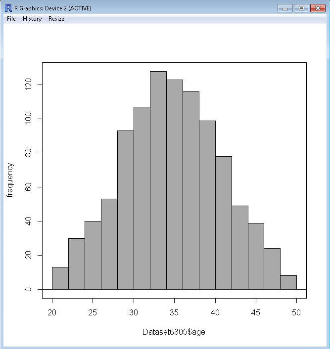
Create a bar graph using the simple frequency distribution for age in
R Commander.
¨
Load your data file into R Commander.
¨
Click Graphs>Histogram… and click to select age, and put 31 in
the Number of bins box (age ranges from 20 to 50, so there are 31 separate
values). Click OK to create the graph.
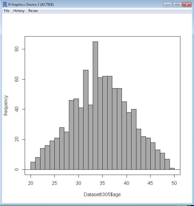
¨
Each bar represent the count of each age value.
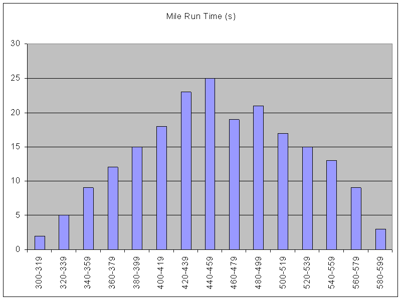
n
A histogram is a picture of a
grouped frequency
distribution rather than the simple frequency distribution. The intervals are shown along the x-axis, and the frequencies
(counts) are shown on the y-axis. The height of the bar represents the frequency
of subjects in that interval of the variable range.
n
This is a histogram of the mile run time data from our previous grouped
frequency distribution example:
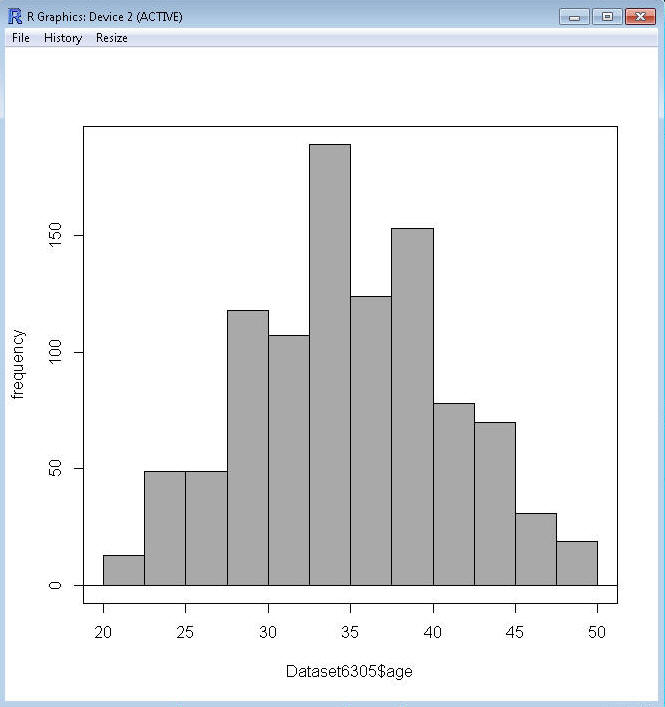
n
Create a histogram in R Commander using the grouped frequency
distribution from the example you worked.
¨
Load your data file.
¨
Click
Graphs>Histogram...click to select age and put 12 in the Number of bins box.
Click OK.
¨
While this is a grouped frequency distribution, you may notice there are more
than 12 bins. That's because R uses a certain rule for making histograms, so the
number of bins you request is only an estimate. To get the histogram for the
grouped frequency distribution you created in the last section, you have to
manually enter the "breaks" in the R Commander Script window. In that window
you'll see this:
¨
Hist(Dataset6305$age, scale="frequency", breaks=12, col="darkgray")
¨
You can change the breaks to the numbers from
the example by typing them in after break
as shown below (the c is an R function that means column, so R
will read what you type as a column of numbers), and clicking the Submit button:
¨
Hist(Dataset6305$age, scale="frequency",
breaks=(c(20,22.5,25,27.5,30,32.5,35,37.5,40,42.5,45,47.5,50)), col="darkgray")
n
You can save graphs that you create in R Commander in the Graphs>Save graph to
file... menu option. You will need to save graphs for a couple of problems on
the exams.
n
Histograms and bar graphs are good ways to show information
in a presentation or report. The relative frequencies in each interval or
category can be easily seen and interpreted by the reader, as opposed to trying
to read and interpret a long column of numbers.
¨
If you connect the midpoints of the bar graph or histogram bars
with a line, you will have a frequency polygon (see Figure 2.2 in the
book).
¨
If you sum the frequencies in each interval to the sum of the
frequencies in all of the intervals preceding it, you create a cumulative
frequency distribution (see Table 2.6).
¨
If you graph the cumulative frequency distribution values, you obtain a cumulative frequency
graph (see Figure 2.3 in the book).
n
When the variable is
continuous rather than
discrete, instead of a
frequency polygon you will have a continuous curve showing the distribution of
values; the curve represents the theoretically infinite number of very very thin
bars that could be drawn and connected.
¨
The shape of this curve can be used to determine if the data
approximate certain well-defined statistical distributions. The most well known
curve is what is known as a normal curve or bell-shaped curve,
which is a curve of the normal distribution.
Click to go to the
next section (Section 2.3)