PEP 6305 Measurement in
Health & Physical Education
Topic 6:
Correlation
Section 6.1
n
This Topic has 2 Sections.
Reading
n
Vincent & Weir, Statistics in Kinesiology, 4th ed., Chapter
8 “Correlation and Bivariate Regression” pp. 105-117
Purpose
n
To discuss and demonstrate the concept and application of simple
bivariate correlation.
Correlation
 n
Correlation is a value that tells us the degree to which two
variables are related. If two variables are related, the value of one
variable can tell us something about the value of the other variable.
n
Correlation is a value that tells us the degree to which two
variables are related. If two variables are related, the value of one
variable can tell us something about the value of the other variable.
n
Correlation analysis allows us to ask questions such as: How much are the values of one variable associated with
the values of another variable? How much does one variable change as another
variable changes?
¨
Correlation is measured by evaluating the extent to which the
deviations from the mean in one variable correspond to the deviations from the
mean in another variable.
¨
The correlation coefficient ranges from -1.00 to +1.00.
Correlation coefficients are interpreted by their magnitude and
sign,
discussed below.
n
Correlation has many uses, such as identifying related characteristics
(such as height and weight; taller people tend to be weigh more), evaluating validity
(whether a variable, such as skinfold thickneses, can be used as a measure of
another variable, such as body fat), or predicting the value of one variable
using the values of a second variable (such as using SAT scores as a
predictor of freshman-year college grades).
n
Just because two variables are correlated does not mean
that a change in one variable causes a change in another variable.
¨
Causality, or determining if a factor caused an observed
effect, which is an important goal of science, is determined through
research design and the systematic way the data are collected,
not by a statistical test.
Scatterplots
n
The concept of correlation can be demonstrated by using
scatterplots.
¨
A scatterplot is a graph of data points for two variables,
with one variable on each axis.
¨
The data points are plotted in the field of the graph according to their values
for each variable. This produces a "scatter" of points; a more narrow scatter
pattern occurs when the correlation is high.
¨
This Web site has an applet that shows how the data points in a scatterplot
change with different values for the correlation coefficient.
n
Open R Commander and load the Dataset6305 file .
¨
Go to Graphs>Scatterplot...
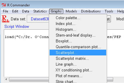
¨
Highlight height in the x-variable box and
highlight weight in the y-variable box. UN-click the
Marginal boxplots, Smooth line, and Show spread boxes.
(we don't need that right now, and it clutters the graph) You can leave
everything else the way it is. Click OK.
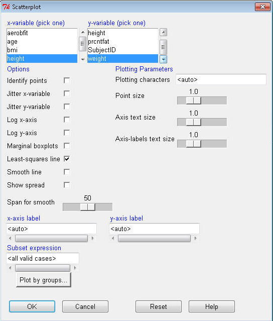
¨
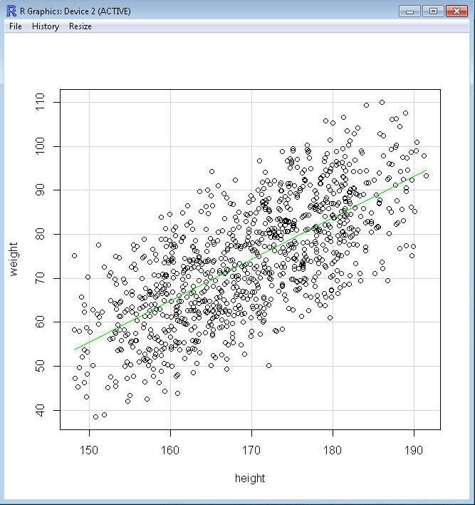
You should get a graph that looks something like this:
n
A correlation coefficient can have a positive or negative value, which is called the
sign
or
direction
of the correlation
and is one of the things used to interpret these coefficients.
n
The scatterplot of height and weight shows a correlation
with a positive sign indicating what is called a
direct association. This also shows that the line of best fit,
shown in green on this plot and which
describes
the linear relation between height and weight, has a positive slope (from
left to right, the line move up).
¨
As
the value of X (height) increases (i.e., as you move from left to right on the X
axis, getting taller), the value of Y (weight) also increases (i.e., moves toward the top on the
Y axis, getting heavier).
¨
Taller people tend to weigh more; shorter people tend to weigh less.
Weight is related to, or associated with, height.
n
A correlation coefficient of +1.00 means that every subject’s
scores are exactly the same standardized distance and the same direction
from the means for both variables.
¨
Any positive value less than 1.00 means that
most of the scores are in the same direction from the mean of both variables and
most of the standard distances from the means of both variables are similar. The
closer the value gets to 0, the less relation between variables and the more
random the points will be on the graph.
n
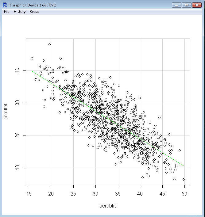
Use R Commander to create a scatterplot for prcntfat (percent body
fat) and aerobfit (aerobic
fitness):
n
This is an example of a negative correlation or
inverse association. The line of best fit now has a negative
slope.
¨
As the value of X (aerobfit) increases (i.e., moves toward the
right on the X axis, getting more fit), the value of Y (prcntfat) decreases (i.e., moves toward the
bottom on the Y axis, getting less fat).
¨
Typically, fit people are more lean that unfit people, who tend to
have a higher relative amount of body fat.
n
A correlation coefficient of -1.00 would mean that every subject’s
scores are the exactly same standardized distance but in opposite directions
from the means of both variables.
n
Note in both graphs that values of X are associated with more than one
value of Y. This spread or "scatter" of Y values around the line of best fit represents the
magnitude of the correlation, which in addition to the sign is
used to interpret the correlation.
¨
The closer that all of the points come to the line, the higher the
magnitude of the
correlation.
¨
For example,
some taller people weigh less that some shorter people. For
example, there is a person who is 180 cm tall who weighs only 60 kg; most people
who weigh 60 kg are considerably shorter--the line of best fit tells us that on
average they are 155 cm tall.
n
If the two variables are perfectly correlated (r = 1.00 or
-1.00) all of the points will lie exactly on the line of best fit.
n
If the two variables are completely uncorrelated, the points will
be scattered at random and the line of best fit will be perfectly flat (horizontal, no
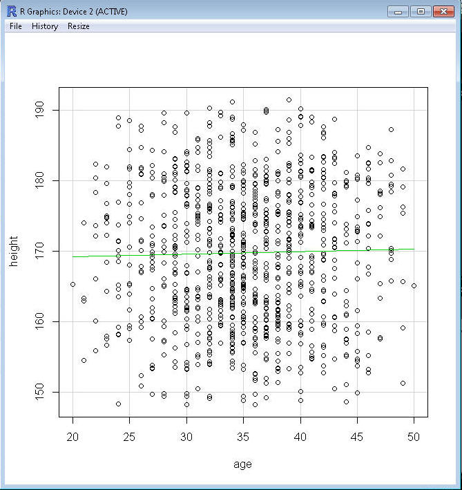
slope). Use R Commander to create a scatterplot for height and age:
n
A correlation coefficient of 0 means that the two variables, age
and height, are unrelated to one another. As can be seen in this graph, older
people are not systematically taller or shorter than younger people.
n
A correlation coefficient provides the magnitude and direction of
a linear association between two variables, which means it is a
measure of whether a line can be used to depict the relation
between the two variables. Two variables, however, may be highly related, but in
a non-linear way.
n
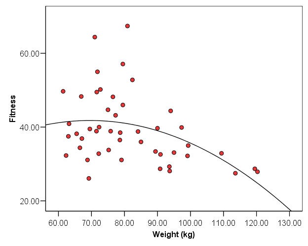
For example, two variables may have a curvilinear
association:
n
Fitness level is relatively unrelated to body weight between
weights of 60 kg and 90 kg (the line is fairly horizontal or flat), but for body weight values
>90 kg fitness level decreases somewhat sharply. Higher values of X are
associated with lower values of Y, but the values of Y decrease at a higher
rate than accounted for by a simple line. A curve in this example is
a better depiction to the data points because it shows the accelerating rate of
decrease in Y as X increases.
n
A correlation coefficient is not an accurate measure of the
association between two variables if the association is non-linear.
n
Non-linear associations can take on a number of forms, none of
which will be discussed here. The important thing to remember is that if a
non-linear pattern is evident in the data, then the simple correlation
coefficient is inappropriate. If you create and inspect a scatterplot
of your data, you can
evaluate whether the relation appears to be linear or non-linear.
 Click
to go to the next section (Section 6.2)
Click
to go to the next section (Section 6.2)