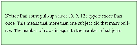
PEP 6305 Measurement in Health & Physical Education


Topic 2: Organizing Data

Section 2.1


n   This Topic has 3 Sections.


Reading

n   Vincent & Weir, Statistics in Kinesiology 4th ed., Chapter 2: “Organizing and Displaying Data”

Purpose

n   Review methods of organizing data for analysis and evaluation.

n   Introduce the concepts of distributions, including distribution tables, histograms, bar graphs, and the normal distribution.

n   Enter data into a computer file in a way that is easy to analyze.

n   Store data effectively to avoid reorganizing it later.

n   This Topic shows you how to store your data so that you can perform your statistical analyses efficiently. 

n   There are many ways to show your data; this Topic also shows you some effective ways to display data under various circumstances.


Rank Order Distribution


n   Simply list the data for a variable in a single column, ordered with the largest value at the top and the smallest at the bottom.

n   Table 2.1 from the text (reproduced below) shows the rank order of the number of pull-ups performed by 15 subjects:


Pull-ups


18


17


16


15


14


13


12


12


10


9


9


8


8


5


2


n   For these data, the number of subjects N = 15, the high score is 18, the low score is 2, and the Range of scores = 18 – 2 = 16.

¨  This information is readily visible by simply looking at the rank order distribution.

n   The rank order distribution is useful for small data sets, with 20 or fewer data points. Larger data sets are difficult to assemble and read in this format.

n   Using Excel, create a rank order distribution using the following data: 525, 505, 507, 654, 631, 281, 771, 575, 485, 626, 780, 626. Click here to download an Excel file containing these data.

¨  The easiest way to do this is to enter all of the numbers in a column, then use the “Sort” function.


¨  Highlight the data and then find and click the “Sort Descending” icon (a small box with a down arrow pointing from Z to A), OR

¨  Under the Data menu: Data>Sort…choose the correct column and select "Descending" and click OK.


n   For these data, what is the number of subjects, the high score, the low score, and the range of scores?


Simple Frequency Distribution


n   The simple frequency distribution is better than the rank order distribution if there are a lot of values because the rank order distribution gets too long.

n   The data values are again listed in descending order in one column, with the largest value at the top and the smallest at the bottom.

n   A second column is added that contains the counts of subjects who have each respective data value; this column is labeled f for “frequency.”

n   Table 2.2 from the text shows the simple frequency distribution of pull-up scores for 212 people:


Pull-ups

f


20

2


19

0


18

3


17

6


16

8


15

10


14

17


13

21


12

25


11

24


10

26


9

19


8

16


7

12


6

10


5

4


4

3


3

2


2

1


1

2


0

1


∑ = 212


n   For these data, the number of subjects N = 212 (the sum of the f column; the Greek capital letter sigma, ∑, means “sum” in math-speak), the high score is 20, the low score is 0, and the Range = 20 – 0 = 20.

¨  All of this information is readily visible by looking at the simple frequency distribution.

n   In addition, you can see that most people performed between 7 and 14 pull-ups. As the number of pull-ups gets higher or lower than this range, the frequencies get much smaller. (This will become more evident when you create graphs of these data.)


n   Using R, import a data file and create a simple frequency distribution.

     Start R, and you should get a "blank" R window:


n   You should have installed the 'R Commander' program when you downloaded and installed R (if not, you'll need it now). Start R Commander by using the Packages>Load Packages... menu. You'll see a long list, scroll to Rcmdr, click on it to highlight, and click OK at the bottom.


Now you should see something like this, the blank R Commander window:

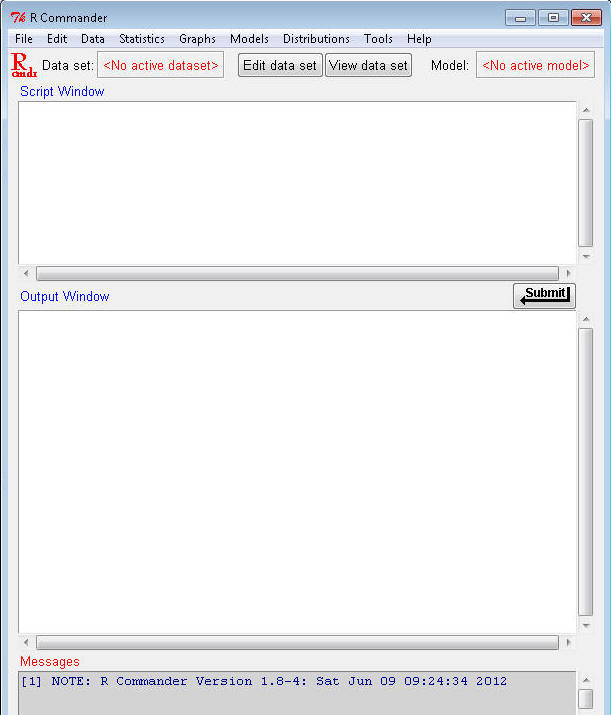
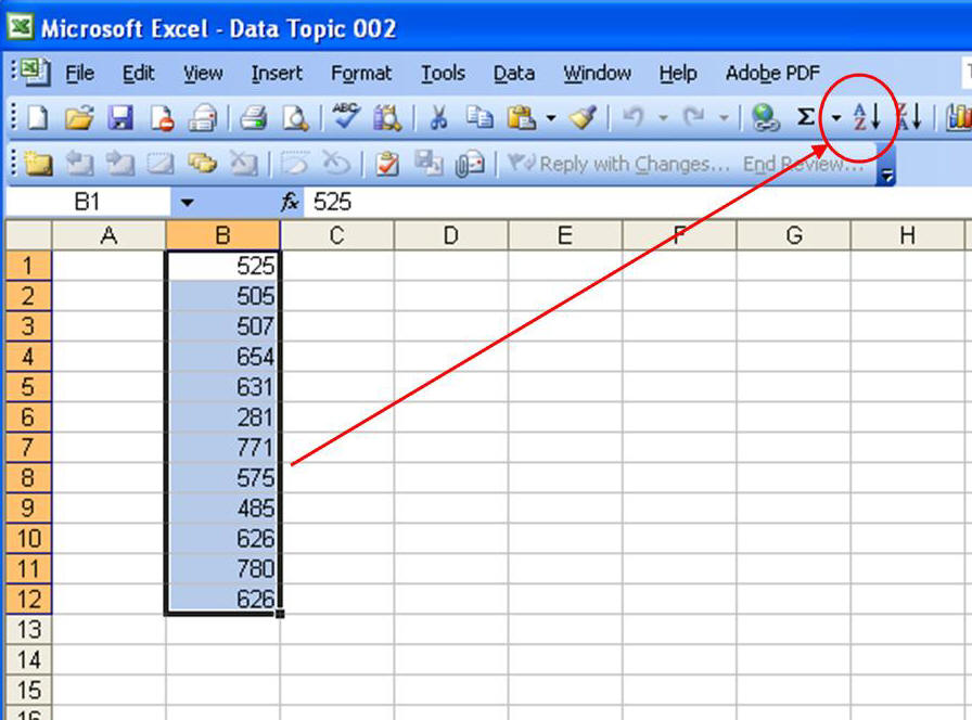
The R Commander allows you to use "point and click" menus as well as entering program language commands in the Script Window box (without R Commander, everything would have to be entered as program commands).

To do statistical analyses, you need data. To follow along with the examples in these notes, download the 'Dataset6305' data file from Blackboard, or right-click and "Save target as..." to download and save 'Dataset6305.RData'. Save it somewhere on your computer that is easy to find, you'll need it for the next few course Topics. This data file is already formatted for use with R (which is why it's file extension is '.RData'). It contains data on several variables for 1000 fictional people - I made the data up, but the relations among the variables are based on relations you might observe in the "real world."

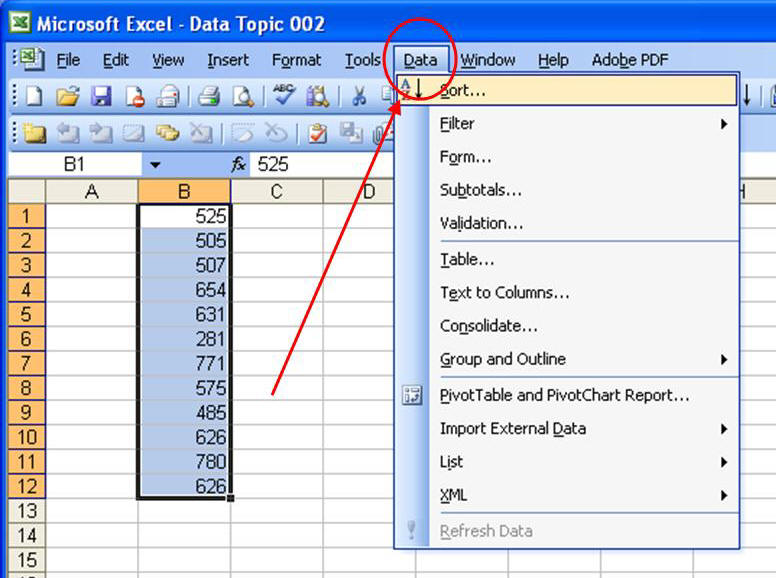
Now you need to show R Commander where the data are. R calls this "loading" the data set. In the R Commander window, click to go to the Data>Load data set... submenu:


Navigate to the Dataset6305 file location on your computer and click "Open". In both the Script and Output windows you should see a message similar to this, depending on your particular file path:

> load("C:/Documents/Courses/PEP 6305 Measurement/Dataset6305.RData")

You will follow these steps each time you open R Commander and load a data file in this course. (You can see your data by clicking the View data set button near the top of the R Commander window.) You can quit/exit R Commander and R using the "File>Exit...both R Commander and R" menu selection in R Commander. It will ask if you want to savel the "Script", which is the commands used to do the analysis, or save the Output, which you'll need to do for some of the exams. The output is saved as a text file that can be read by any word processing program.

Now, finally, back to the analysis! You'll evaluate the simple frequency distribution of the variable age in Dataset6305. This analysis will show you how many people of each age are in the sample.

Click in the the Script Window and type table(Dataset6305$age) (what does this mean?) or highlight and copy this text and paste it in. Then, with the cursor still on the same line, click on the Submit button (just below and to the right of the Script Window). The Output Window shows the following:

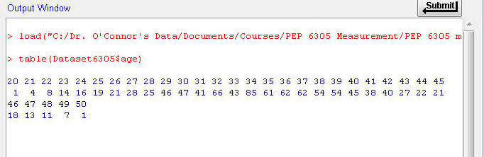
This shows you the frequency (bottom row) of each age (top row, ages 20 through 50 years); for example, there are 85 people age 34, 40 people age 42, and so on. This frequency distribution is horizontal rather than vertical, but shows you the same information.

n   A simple frequency distribution is best when there are less than about 20 values. Otherwise it becomes harder to read, as with the 30 age values in this example, and similar to the rank order distribution when there are >20 subjects.


Grouped Frequency Distribution


n   The grouped frequency distribution works better than the simple frequency distribution when the number of subjects and the number of values is large--like our example of 1000 subjects and 30 values for age.

n   Small intervals of data values, called "bins", are listed in descending order in one column (or row in R), with the largest values at the top and the smallest at the bottom.

¨  How many small intervals or bins do you need? 12 to 15 usually works best, as described in the text.

¨  To compute the size of each bin, divide the range by the total number of intervals.

¨  When the data are continuous rather than discrete, the process for bin size is the same, but the "real" limits of the intervals are the halfway points between the upper limit of the lesser interval and the lower limit of the higher interval (see pp. 25-26 in the text for an explanation of "real" and "apparent" limits for continuous data).

n   The second column (or row in R) contains the counts of subjects with scores in each respective bin.

n   Table 2.3 from the text shows the grouped frequency distribution for 206 mile-run scores:


X

f


580-599

3


560-579

9


540-559

13


520-539

15


500-519

17


480-499

21


460-479

19


440-459

25


420-439

23


400-419

18


380-399

15


360-379

12


340-359

9


320-339

5


300-319

2


∑ = 206


n   This distribution indicates that most people ran one mile between 380 and 519 seconds, but, unlike the previous two distribution displays, we can’t tell the exact times of each subject or the exact range of values.

n   Grouped frequency distributions work well when presenting data to summarize results, such as at meetings or in written reports, particularly when there are a large number of subjects and a large range of data values.

n   Load your data file using R (if it's not still open) and create a grouped frequency distribution. 

¨  In the Script Window, type table(cut(Dataset6305$age,12)) (what?) and click the Submit button. The Output Window shows:


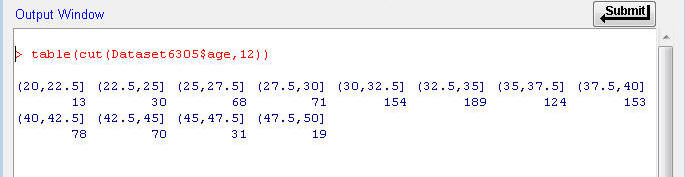
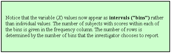
This output shows the number of people with age values in each of the respective 12 bins. The values included in each bin can be read in the top row. The paranthesis and square bracket notation tells you where the breaks are. The paranthesis mark indicates that the bin's boundary is at the value, but does not include the value. The square bracket indicates the bin's boundary includes the value. The first bin starts at 20 and goes up to and including 22.5. The second bin starts at just above 22.5, but does not include 22.5, and goes up to and including 25. And so on. (The first interval actually starts just below 20 so it includes 20, but that "just below" value is not shown in the R output.)

You can save the Output window as a text file by File>Save output as...


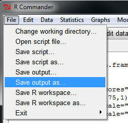
      You'll see the typical 'Save' dialog box, and you can navigate to the folder on your computer where you want to save it, and name it whatever you want.

     THIS IS IMPORTANT: You will be asked to turn in the saved output file from your analyses for the exams.  

Click to go to the next section (Section 2.2)